We talked to Michael Stevens, Founder of Filament Design, and creator of this year’s SHOW identity about his creative process and the inspiration for the identity.
Tell us about yourself and your studio Filament.
I got into art and design at a very young age and always loved to draw as a kid. My grandfather was an industrial designer for Parker Pen and Studebaker in the 50s and 60s, so I think somehow the design bug got passed down from him to me. I started off studying painting and drawing in college, but eventually wound up trying some graphic design classes and never looked back.
Filament has been my freelance graphic design practice for over a year now. I really love the freelance life, and I definitely don’t take the flexible schedule and creative freedom for granted. Most of the work I do these days is in the sphere of brand identity, usually with a heavy emphasis on typography and illustration.
What kind of questions do you ask before beginning a design project? Which piece of information is of utmost value?
Wow, that’s really tough! I heard an interview with the film composer Hans Zimmer where he said he approaches every new scoring process convinced he has no idea how to write the music for the story at hand. I’m really inspired by that idea of radical openness at the start of a project. I’ve actually moved away from asking a standard set of questions in favor of just getting to know my clients and collaborators as organically as possible, so it’s different for everyone. When the discussion evolves naturally the most important questions seem to surface on their own.
An image from Michael’s development process.
What was your inspiration for the SHOW identity?
With this year’s identity, I wanted to develop a visual approach all about layeredness and criss-crossing elements. One thing that makes professional design such an interesting career day to day is that the work demands we exist at the center of a really complicated cultural Venn diagram. That idea of intersection and overlap between different ideas, people, and roles was what led to the layered, multicolored typography for this year’s identity.
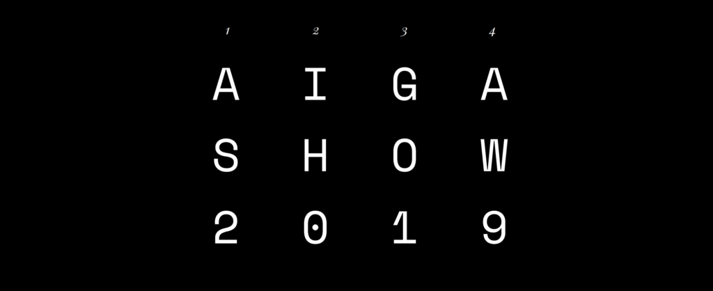
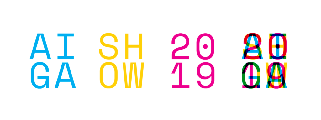
I also found that because the words AIGA, SHOW, and 2019 are each 4 letters long, there were some interesting possibilities with layering and lining the words one on top of the other in different colors. All of the abstract patterns and colors for the identity (like the hero for the website and the front of the postcard) are actually just close-up crops of the angles and overlapping corners made by the letters in those three words.
Another image from Michael’s process in developing the SHOW identity.
What was your creative process when coming up with the SHOW identity? Or your creative process in general?
Like I said, I try to be wide open to wherever the creative process leads, but the breakthrough with this project was realizing that a monospaced typeface could provide the regularity needed to get AIGA, SHOW, and 2019 to line up when superimposed. From there it was an exploration of overprint-style color effects between those layers, and the realization that the angles within the overlaps could become design elements in themselves when blown up to a large size. Once the idea was off the ground it became obvious that finding a way to animate everything would be an exciting next step (more on that later!)
What were the biggest challenges when working on the SHOW identity?
It was really important that there be unity between the print and digital expressions of the system, and from the beginning we wanted to incorporate an animated element. The biggest challenge has been to create a system that feels like it was made for print, made for web, and made for motion.
Ideas for the poster for the event.
You collaborated with another designer to produce the animations. What is the process like working with a collaborator?
Watching Jase Heuser bring this identity to life has been amazing. We’ve been collaborating on some other projects lately as well, so going into the SHOW identity I already knew he’d do a great job. He’s actually been working remotely on this project, so it’s been fun to go back and forth with the files—it’s really delightful to send off a static design and see it come back completely transformed.
Do you often collaborate with other designers on projects? What makes for a good collaborator?
I do collaborate quite a bit—more and more as I continue to freelance. For me, I think a meaningful collaboration takes not only trust, but also a genuine sense of curiosity and excitement to see where your collaborator might take things next. I think too, it can help to have somewhat different skill sets so each person is offering something unique and there’s plenty of room for the unexpected. In my mind the real power of collaboration isn’t that it allows you to work faster or in higher volume—it’s that it allows you to work in an entirely different way. Finding that perfect balance of overlap vs. diversity of skills is key to that.
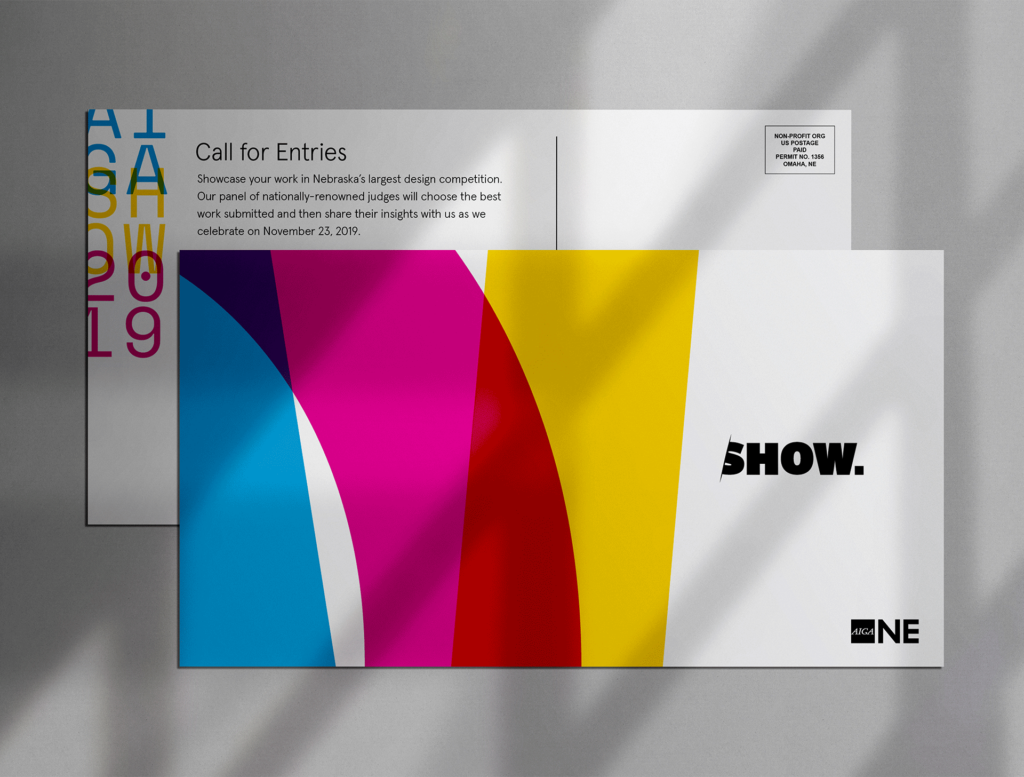
Example of SHOW postcard created by Michael.
What is your favorite part of SHOW?
My favorite part of SHOW is seeing the quality of the work itself on opening night. Each year it seems like the work gets better and the bar gets higher. It’s inspiring to see Nebraska’s design community come together in one place and there’s always a lot of energy in the room.
Thank you Michael for your hard work on our Show 2019 branding.